CALGARY’S SPARK SCIENCE CENTRE…IT HAS BLINDED ME WITH THE SCIENCE!
PROJECT: TELUS SCIENCE CENTRE
SERIES: CALGARY URBAN DESIGN
PHOTOS + COPY: ANGUS MACKENZIE
Telus’ SPARK Science Centre illuminates & cultivates the scientifically curious in all of us
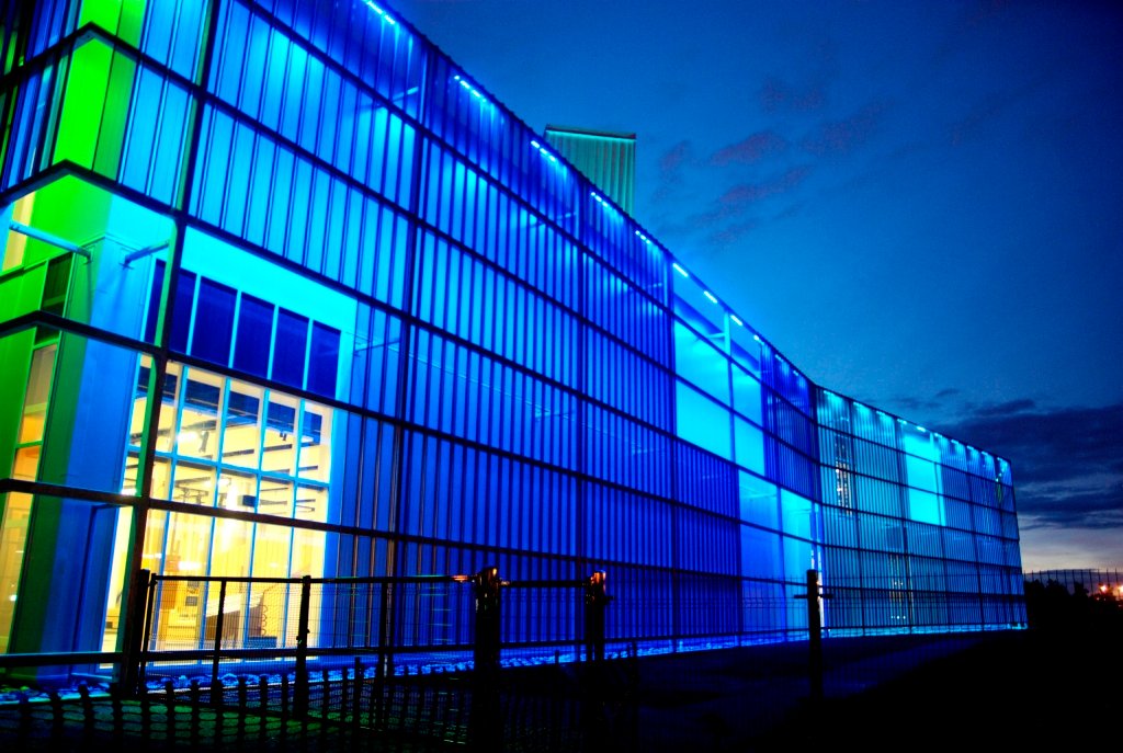
With hyper-saturated neon glowy-ness just off Deerfoot Trail, Calgary’s new science centre pops out of the reclaimed landscape like a not so well hidden rave house…if we listen carefully you can almost hear the glow-sticks and binkies in the distance. But this is no eden of 256 bpm iniquity, this is the newest facility of all things sciencey and good – a Libeskind-esque fortress of solitude whose shardlets jut from the ground like a crystalline experiment. This multi-coloured box is the new Telus Spark Science Centre with a mandate is to make science cool again, unlike Stephen Harper.
SPARK was designed with the intent of being catalyst for the curious, in a nerdly, geek-like way for all ages. ‘Spark is meant to ignite a sense of wonder & fuel the imagination’ according to the press package. Other sparky superlatives like; flashes of inspiration, illuminating, and brilliant all work to drive home the verbological concept of the centre as a vehicle to educate and inspire. There’s inspiration twice so I guess it works.
Replacing the fondly remembered downtown science centre SPARK was finished in the fall of 2011 on reclaimed city land. At $160 million dollars and 153,000 sq. ft. the centre provides more than enough space for future scientists and innovators to blow shit up.

One possible reason that Canada is falling behind the world in innovators and innovation could be attributed to the fact SPARK is the first new science centre in 30 years. Innovation? Who needs innovation when we have oily gassy deposits to last us one billion years.
In designing content for the space, focus groups were invited to participate and provide input in various test sessions. From these sessions culminated four approaches: Open Studio, Being Human, Energy & Innovation, and Earth & Sky. Most likely the ‘blowing shit up’ sessions would occur in the ‘Being Human’ exhibit.
Angley and pokey in certain aspects, veiled and cloaky in others, the exterior design of SPARK is certainly frenetic, but still manages to flow with a not so bad aesthetic rhythm. According to the press release, the building is largely built of steel. Yes it is.
Corrugated crystalline sections protrude from the ground providing a break from the west sides voluminous massing. To help lighten the massing and provide additional visual personality to the space an encasing metallic exo-skin wraps the majority of the vertical surfaces. Solar shaded and protected with ‘scrim’ spaced roughly 2 metres from the main building, the skin is broken by rectangular negative spaces, occurring across varied intervals. Lighting inset between the skin and building varies the personality of the space across an RGB Moodring spectrum at night.
Inside away from the raving light show, the space opens up dramatically with wooden panels and expansive ceilings. The main walkway crossing over from exhibits on the second floor is the architectural highlight of the interior. Juxtaposed angles and sandlewood covered panels criss-cross each other in an effort to stay true to the centre’s ‘sciencey’ and innovative mandate. The cool nerd out science geek stuff is of course what the centre is all about. Hand on interactive exhibits like ‘open studio’ challenges visitors to question established assumptions and redefine creative thinking via smashing, light painting, symphonic colour composition, shadow dance or simply blow shit up. Actually no blowing up here, smash only.

Juxtaposed angles and sandlewood covered panels criss-cross each other in an effort to stay true to the centre’s ‘sciencey’ and innovative mandate
In Being Human, you learn how slow your reflexes are, or how bad your memory is getting or whether the date you’re with is compatible or a deadend. Super. This one is better left to the younger folks who haven’t had a chance to properly form egos or their identity yet. In ‘Earth, Wind & Fire’ a talented band of young musicians, totaling 34 in all, throw out some of the best disco, soul, R&B and funk of the era. There’s also miniaturized avalanches, constellation staring, landscape erosion exercises and other stuff.
In Energy & Innovation oil companies use their sponsorship opportunities to ‘explore the properties of petroleum’. In this exhibit visitors are learned about how to build a pipeline from the north to the BC coast, then carefully maneuver tiny single-hulled oil tankers through ghost islands without running aground and killing thousands of seabirds and indigenous wildlife. And then there’s a wind turbine. The creative kid’s museum will be the highlight for the wee ones. I give it 5 interactive waterfalls out of 5.
The amount of work and thought that has gone into the spatial design and interactive components is impressive. Exterior architectural elementes are better appreciated at night with the changing light. The ROM’s stolen shard elements are a nice breaking touch, if not overly plagiaristic.
So given SPARK’s mandate of igniting creativity and sparking curiosity I’d have to say they’ve succeeded in providing a cohesive facility in which to foster future thinkers.
Source: Telus Spark Science Center
*Certain interior photos may appear off thanks to inexperienced HDR manipulations
