The Unbearable Lightness of Being: Thomas Balaban’s Holy Cross House
Photos: Adrien Williams
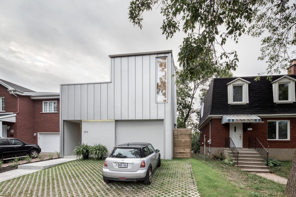
Located in Montreal’s southwest and recipient of the Residential Space (1,600-3,200 ft2) Award at Québec’s Grands Prix du Design 2014 the Holy Cross House by Thomas Balaban Architect looks overly simplified from the street, but it belies an interior that is anything but blando ballet.
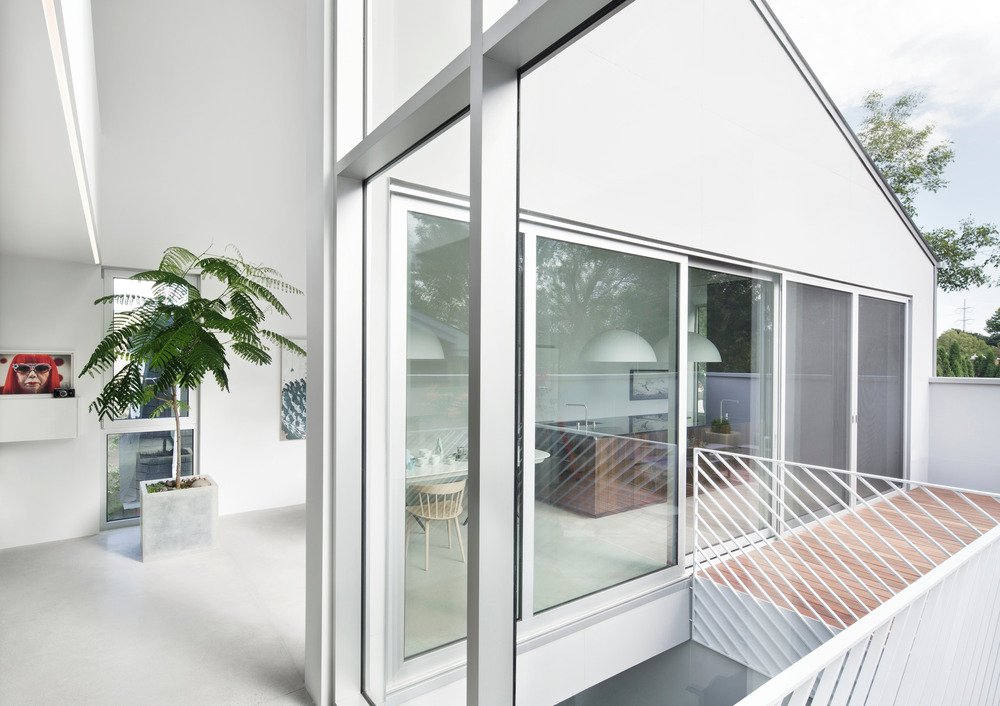
According to the v2com press release, “The 300 m2 detached house hides a rich spatial complexity behind its tough working class façade. Turning to the neighbourhood’s post-war veterans home as its formal point of departure, the architects set out to make a house that simultaneously fits in and stands out from its heterogeneous context without resorting to mimicry and without sacrificing the contemporary nature of the project.”

Because of the tight packaging and lot size, getting light into the living spaces was a significant challenge. But according to the release, “…by flipping the traditional vertical hierarchy found in most two storey homes and by carving out a series of spaces from the house’s volume, the project was able to address the need for exposure to direct light and concerns about maintaining privacy.”

By placing the living spaces upstairs, the design provides optimal sunlight to the most important rooms. And by “carving out of the house’s volume, the light available at the center of the lot is drawn down into the heart of the house and additional private outdoor spaces are provided for each room.”
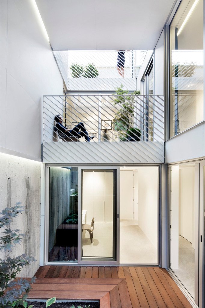
A “staggered central outdoor courtyard” was incorporated to funnel light all the way down to the house’s lowest levels, which was critical as all rooms have access to this central space. Adding to the importance that light plays within the Holy Cross’ design are full-height windows located at different levels that provide a “theatrical quality to the courtyard space.” The windows also allow residents to keep one another in line of sight from most any spot in the house.


The interior design not only enhances light-flow but also provides for more efficient natural ventilation and air movement throughout the space. Stacked staircases running parallel to the courtyard and a north-facing opening at the top of the space make for a cooling chimney effect while south facing glazing increases direct solar gain in winter. Radiant concrete floors also help to warm the space during Montreal’s less than balmy winter months.

From the outside the house is euphemistically referred to as “restrained, light and monochromatic, with emphasis on overall form over components and details.” To bring unity and harmony to the house Balaban and Co decided to go with a standing seam aluminum cladding that could serve as both roofing and wall cladding. Flat concrete panels were used as accent pieces around doors and windows to match the metal cladding’s look and feel.


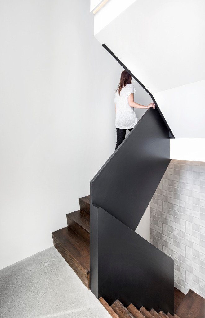
From the release, “…the interior is also kept uniform, strategically articulated with warm touches appearing in the millwork and central stair. Pale, mat polished concrete floors and unarticulated white walls place the focus on the homeowners’ collection of art and design objects.”
The home’s kitchen is organized around two key elements; the island and the storage wall which both use the same heat-treated white oak in their build and finishes. The rich wood works to bring warmth and contrast to an otherwise cold, bleak space.
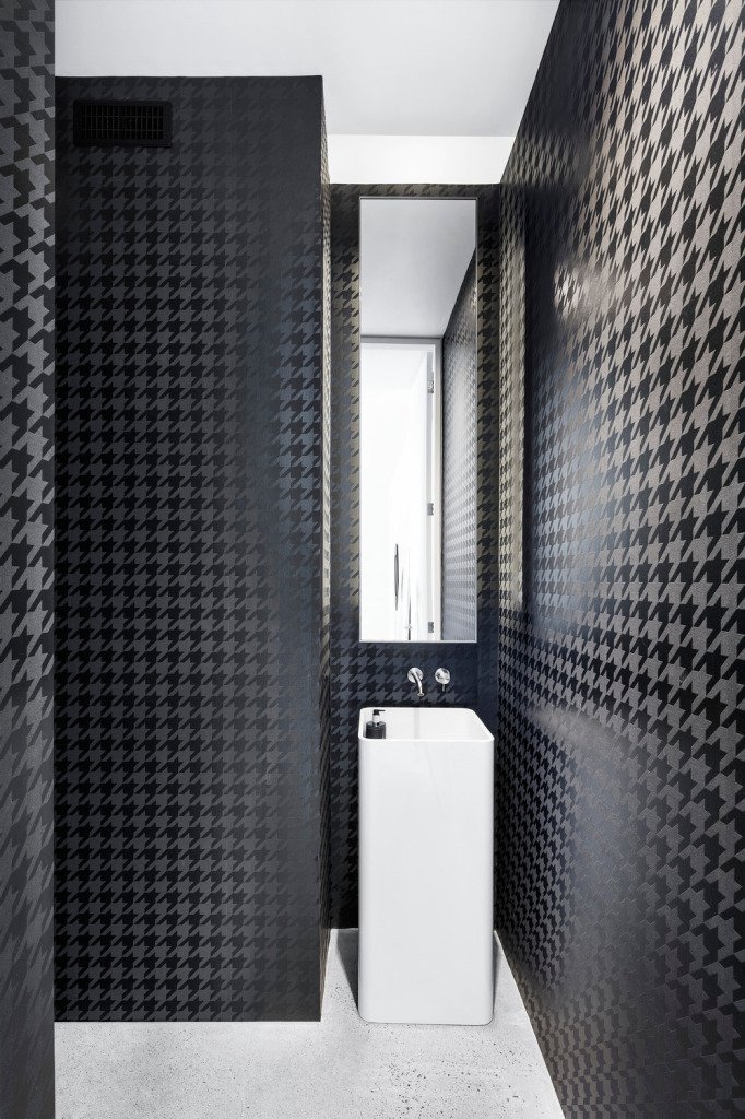
The “darker, graphic tones” in the bathrooms are intended to contrast with the home’s overall mandate and play against the vegetation that’s visible through the many windows populating the exterior.
Source: v2com
Would love to know if it is possible to get a subscription. Editing magazines and had forgotten
Elemente…..unfortunately. Loved the Zaha Hadid 2009 issue. Thank you.
Hi,
Thanks for the note. Unfortunately elemente is no longer available in print format.
Only updating the site with fresh content occasionally.
Angus